


LinkedIn just announced a redesign of the platform and it brings desktop version in line with the mobile browser one. The new look will be rolled out over the period of next few weeks.
Changes To Be Seen
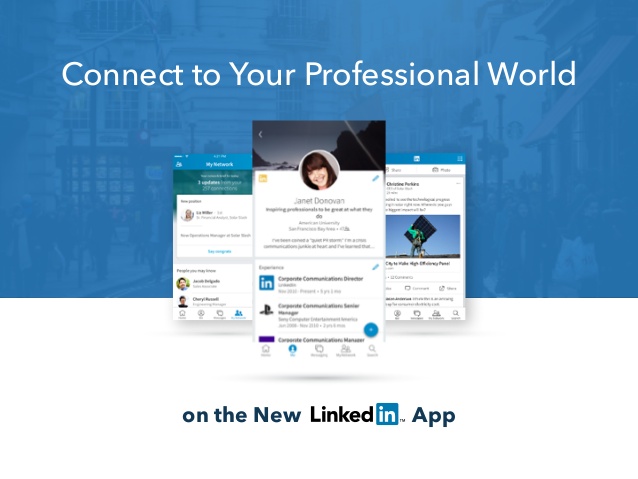
The navigation bar will be streamlined in the new design. It will now equip seven core areas and those are Home, Messaging, Jobs, Notifications, Me, My Network and Search.
The messaging henceforth will be much smarter with a real-time interface equipped with more robust capabilities like able to identify those who are within user’ss network, who work at a company, or whether user would like to work.
The feed on the platform is now richer and more relevant content will be seen through a combination of algorithms and human editors.
The search box now got filter options too to make searches more intuitive.
Profile suggestions have now become better than before.
The search box is located next to the navigation bar in a pull-down menu. Users can now search easily by specific topics like jobs, people and universities.
The “more” icon launches LinkedIn Learning and other options.
Enderle Group principal analyst said, “If time is important, they seem to have optimized for this.”
He added the new look is informative and clean too, making more sense to keep users engaged more.